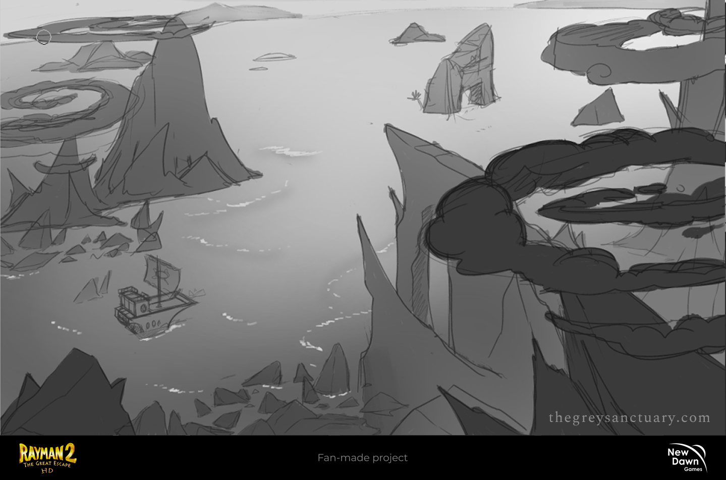
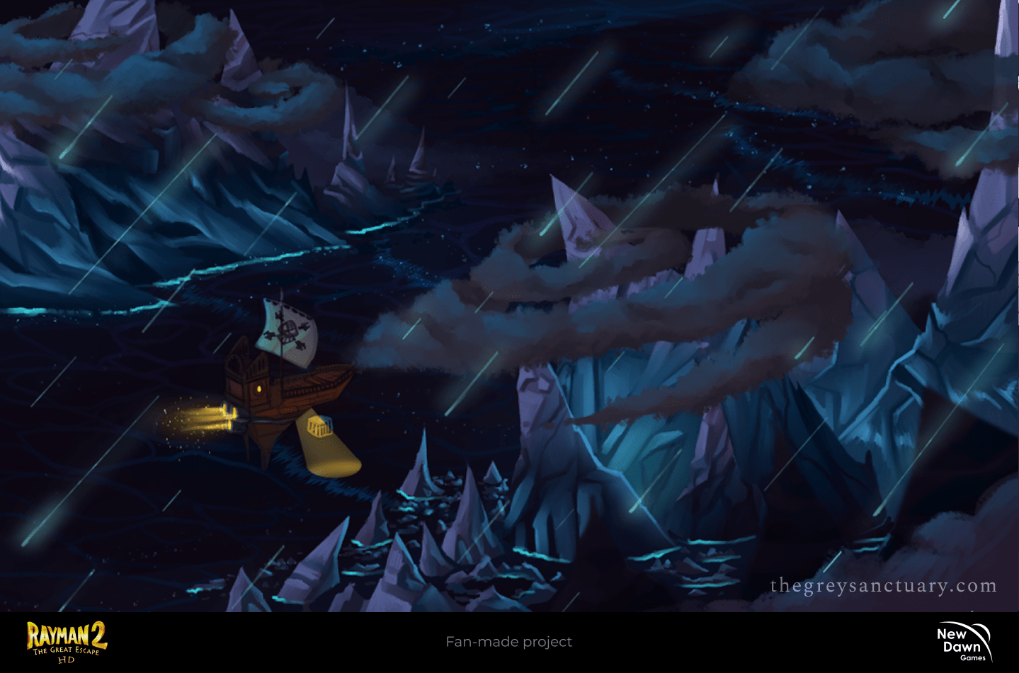
Rayman 2 Remake
Rayman 2 is a fan-made project by @new_dawngames composed of many members. I started off as a concept artist and was asked to be part of the redesign alongside with other 2 other artists. My main job was to explore early development. Now, as an Art Director, I have to maintain consistency with visuals, guide the team, assist in technical areas, and most importantly, influence my creative skills, alongside the main director to complete a faithful but fresh final product.
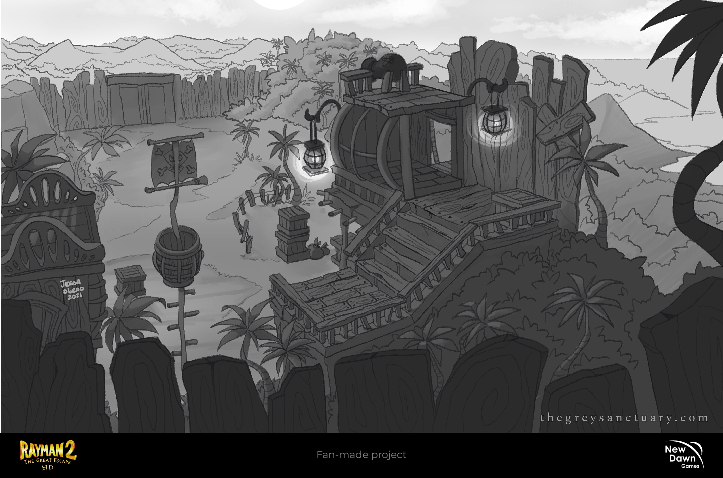
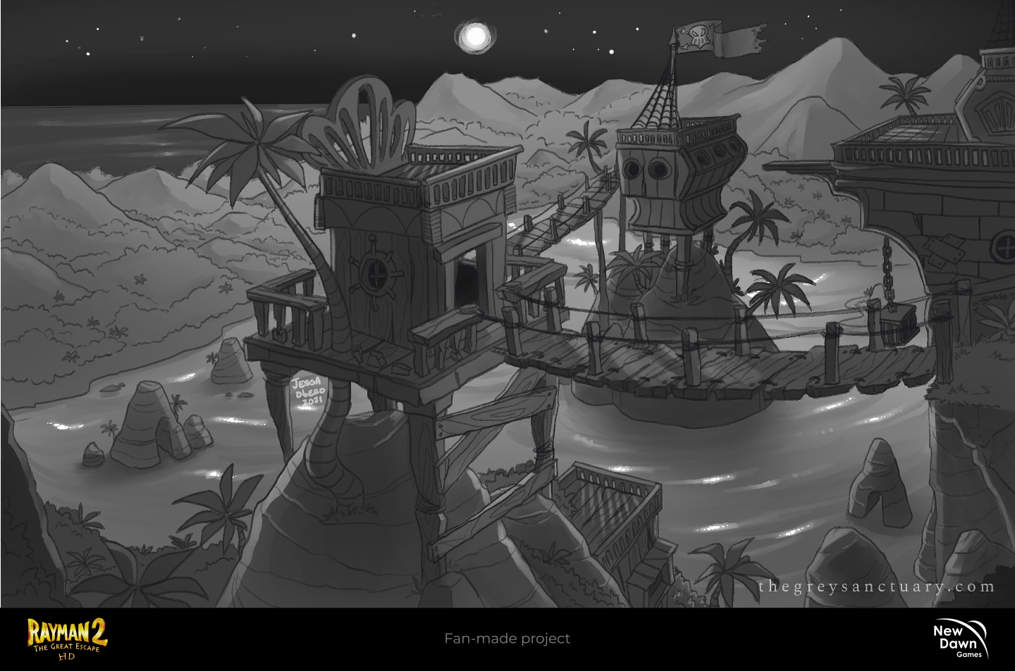
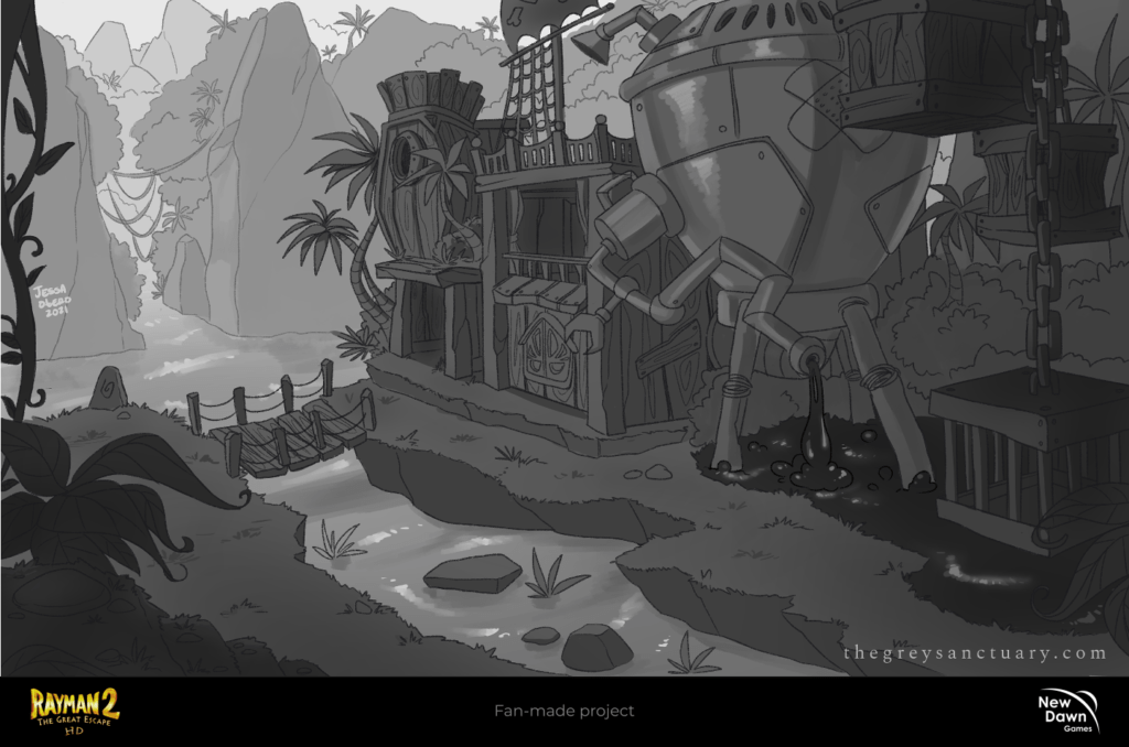
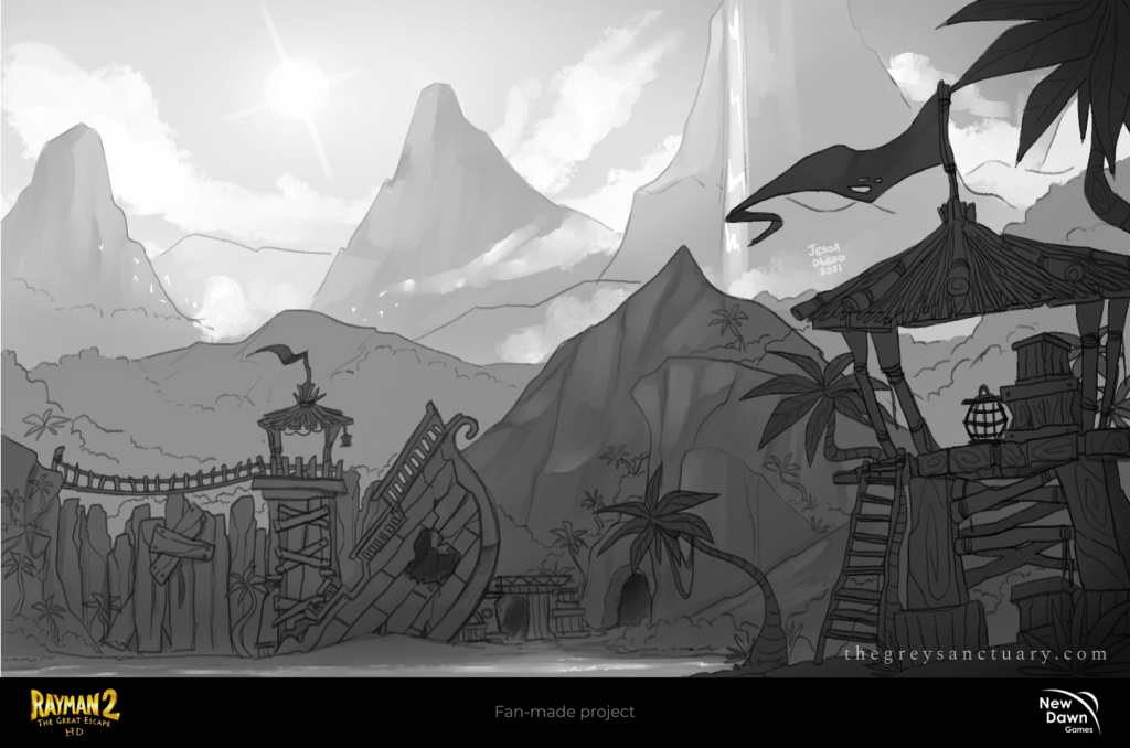
As I explored interior-exterior setups, different locations with perspectives, and settings (night or day), I realized I was struggling with visual language. Before I could learn to do the concepts correctly, and consistently, I was given some constructive criticism in the beginning.
As you can see, these were my first drafts. I was a bit overwhelmed by the process and usually had a hard time establishing and defining elements. The designs seemed rigid, like made with fear or insecurity. After a little brainstorming, research, references, and a few words with the team, I was able to go with the flow.
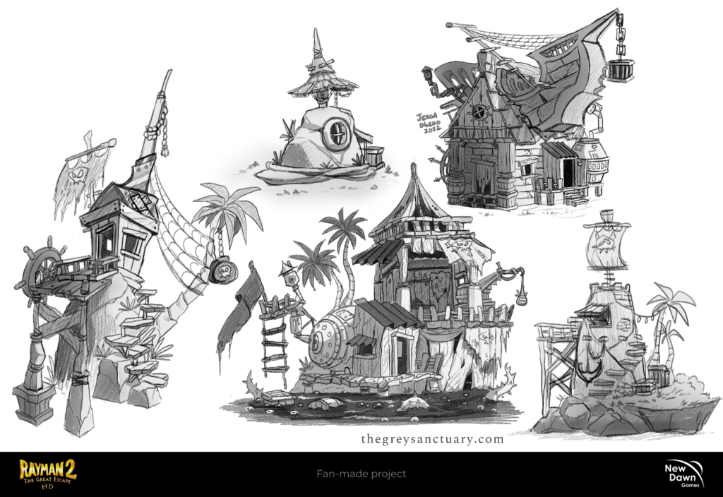
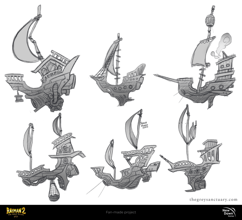
CHAPTER 1: Pirate Structures
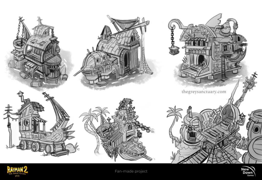
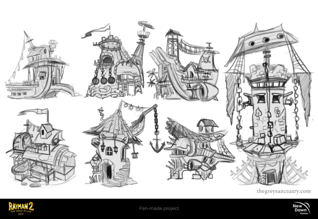
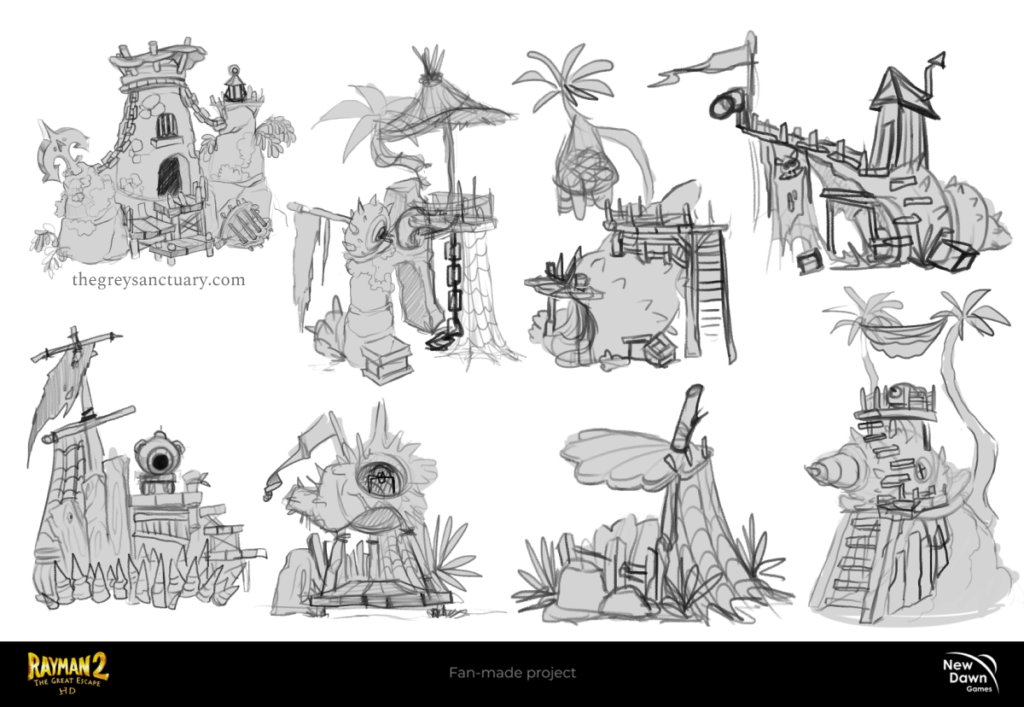
A redesign is meant to deconstruct the main idea/result and make it more refreshing and interesting without losing the nostalgic touch. Rayman 2 has a lot of copy-paste elements of duplicated visuals (nothing wrong with that). In this case, I researched as many references as I could, to explore alternatives in the redesign without looking boring or repetitive during structure development. The idea is to complete a set of appropriate props that can be duplicated, mixed, and matched by the team to build structures in the appropriate categories.
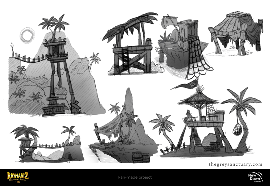
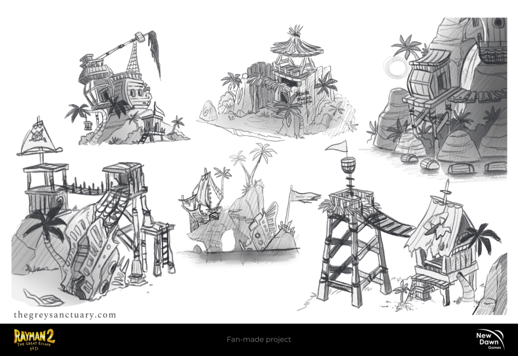
Patrol Stations & Fortresses
Because the pirates’ structures were made with specific materials such as wood, stone, and metal, I proposed to the team to create the 3 categories for the pirates’ structures:
Cheap – The first stage is messy and not logical, with incomplete setups or broken pieces. Since pirates were in a rush, lazy, and stupid, their stations were made in poor conditions, using any materials available without any strategy. Often, since they were extremely lazy, they would build around flora.
Mid – The second stage is more organized but still a bit wobbly. It has a bit of durability by using metal, the only peculiar detail, is that the structures are built upon broken ships and use metal as material, which is more sophisticated and resistant. Did I say it also includes booby traps for fun?
Heavy – The third and final stage is incredibly well-built, using premium materials and demonstrating elegance with the touch of Victorian-Baroque design elements.

CHAPTER 2: Environments
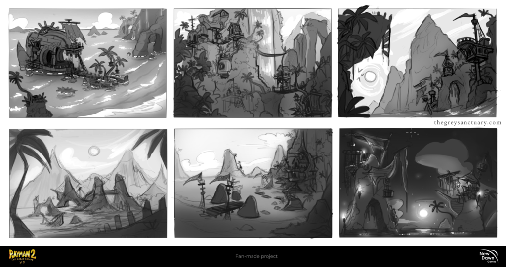
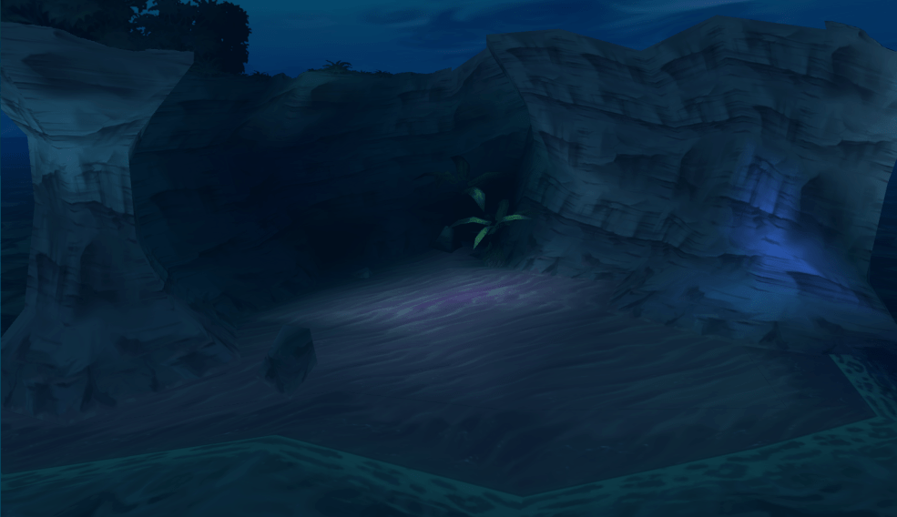
For the second round, we were asked to begin the environment design for the Fairy Glade level. They needed the main level drawn in various alternatives, including individual assets. The director compiled a PDF document about R2HD Artstyle Guide with other members for protocol, I call it “The Bible”. The main task was to create props and environment concepts and/or breakdowns so that the modelers could work the 3D renderings from our work. My first task was creating assets for the tree bark, with “a balance between putting too much detail and not putting enough”.
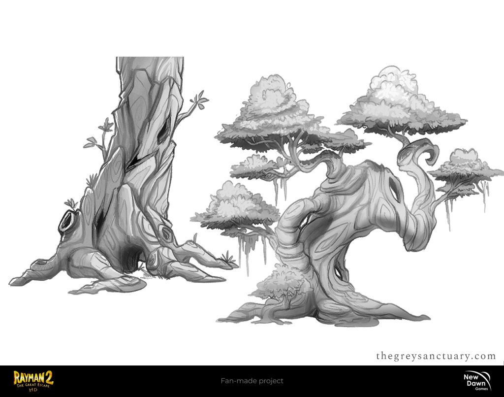
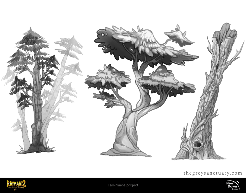
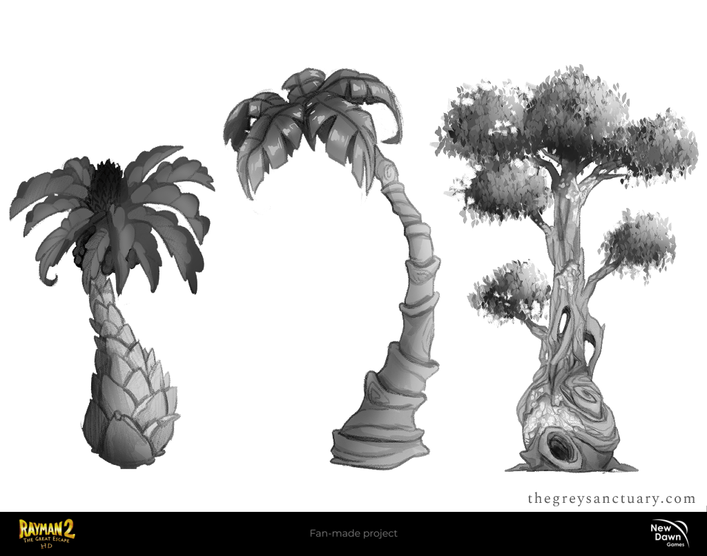
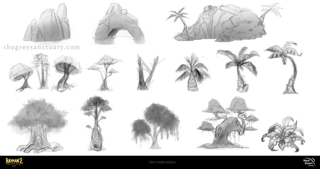
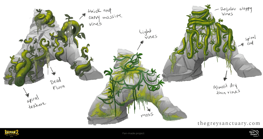
After creating several concepts and polishing details, I was able to pull off the “putting too much detail and not putting enough” in the last tree (third image). Coincidentally, that same tree was the one I was not satisfied with after many attempts to recreate a specific texture. Below, the modelers were having a hard time constructing the vines since they didn’t have a breakdown concept art of it, besides the image of a flat pattern of vines from the Rayman 2 screenshot. So they asked for my help and I gave them a few alternatives to work around.
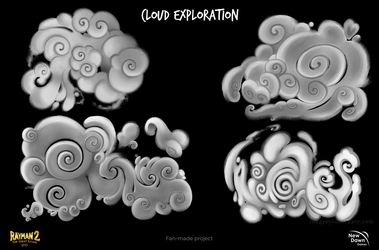
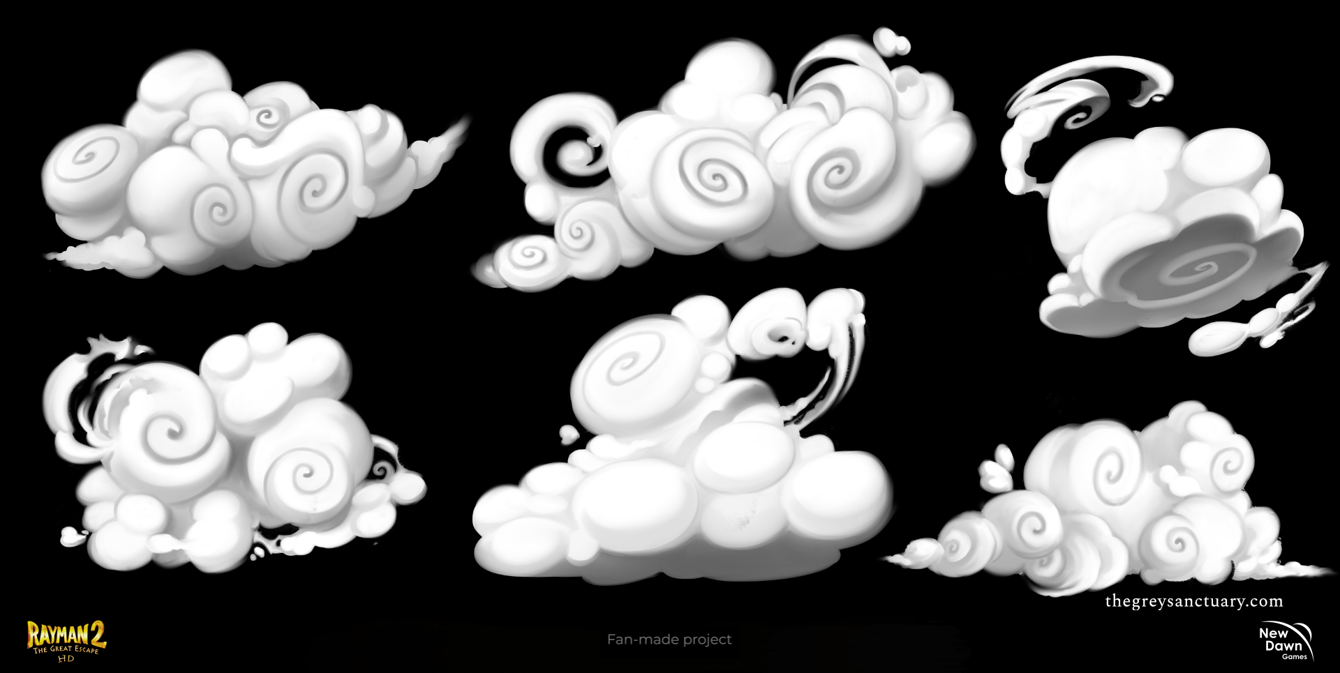
In this particular task, I asked to work on several cloud concept art following the original elements from the previous game. Some did comply with the desired results while others were too complicated to be considered. Soft edges, paint texture, and swirls are the most common elements found in these explorations.
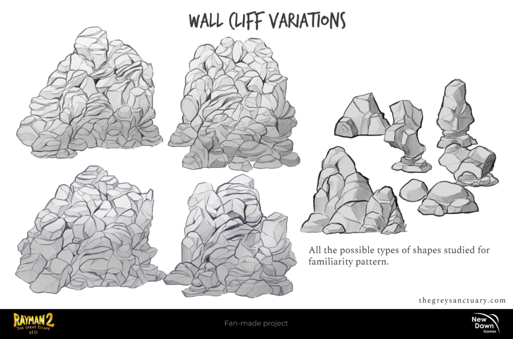
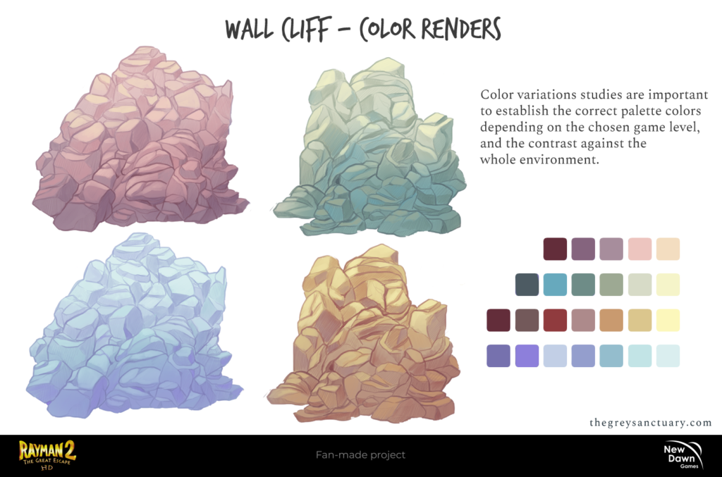
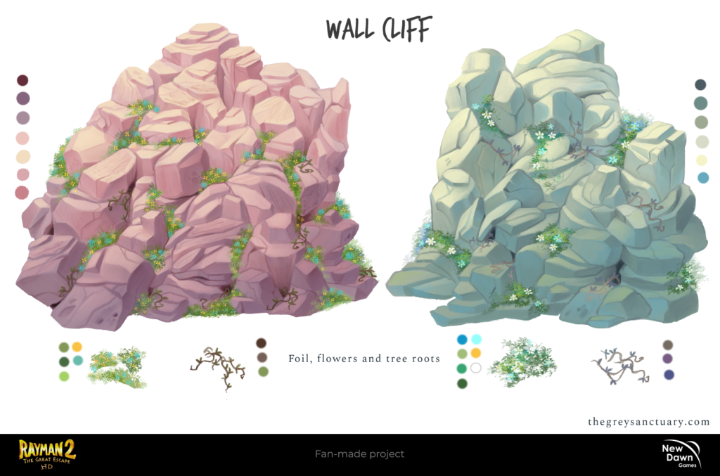
Moving on to the final task, we decided to explore the wall cliff for the Fairy Glade level. We went through a lot of brainstorming, including making several wall cliff variations ranging from simple to complex formats, palette colors, and final rendering. I made several color variations to see which were suitable for the Fairy Glade level and we ended with the brown and green palettes. Color variations studies are important to establish the correct palette colors depending on the chosen game level and the contrast against the whole environment.
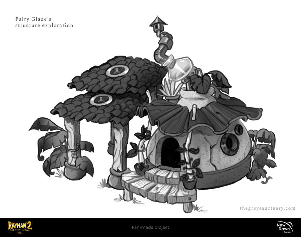
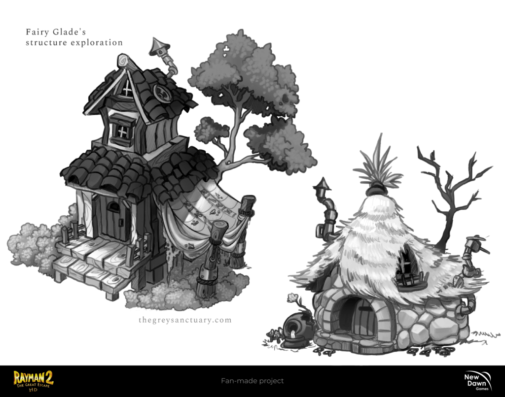
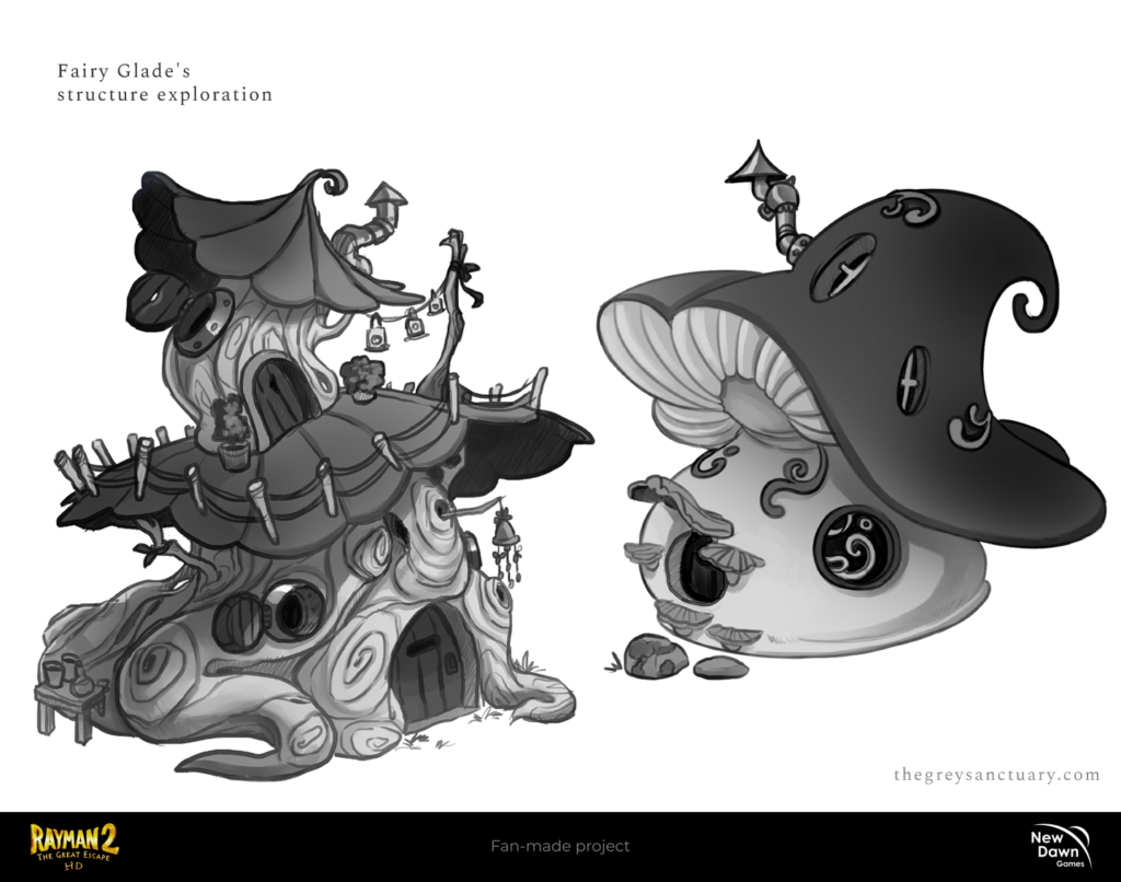
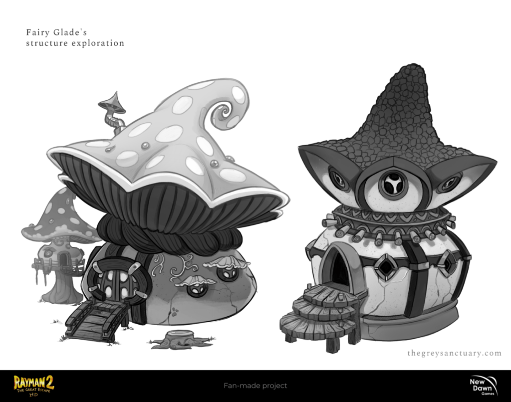
CHAPTER 3: Fairy Glade Structure
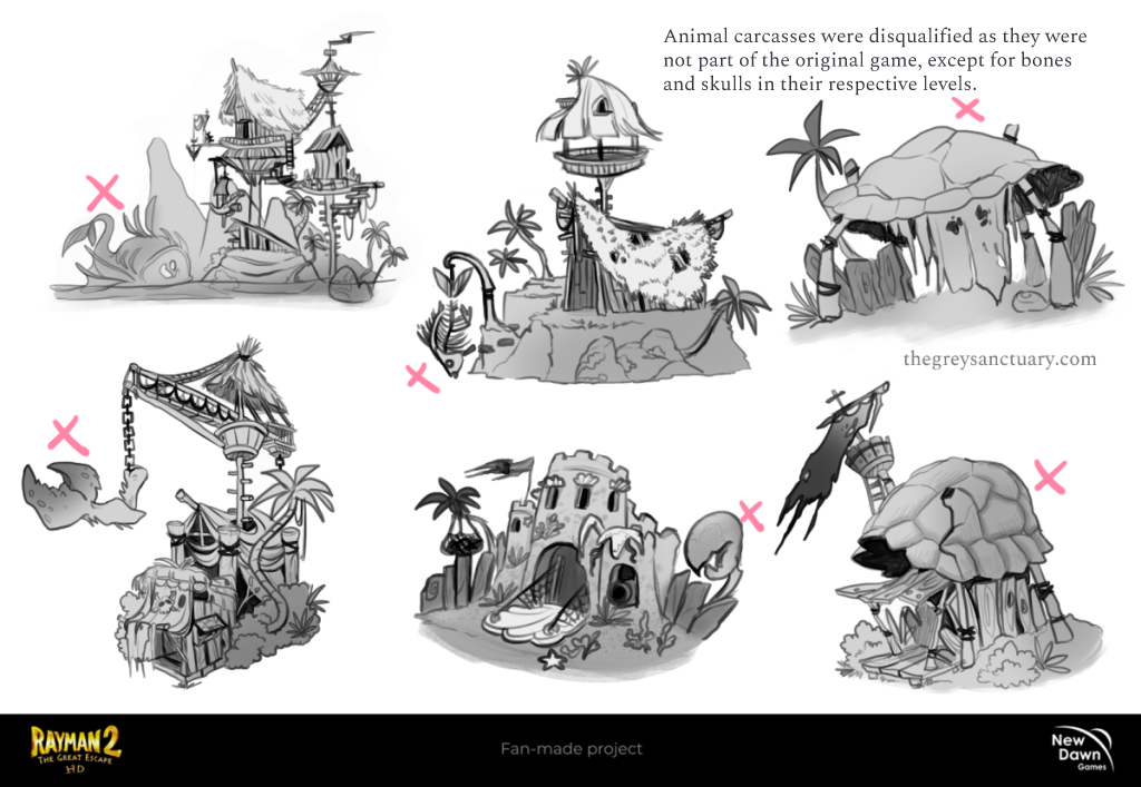
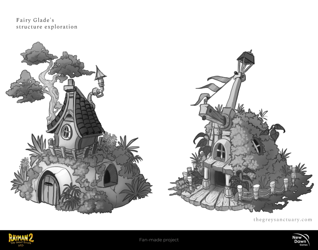
One of the members was having difficulty with the redesign of a “house” on the Fairy Glade level. It looked like a balcony with a weird roof, and almost an invisible chimney to the top left. We made a few explorations and concluded 2 things: structures fully wooded should be only classified as pirate’s zones, and adding more foliage to the buildings was risky since it could get loose contrast against the environment overall.
So, the last 4 designs resemble an organic structure in harmony with the environment without much distraction. It made sense to make it this way, so it could stand out from the pirate’s structures. We were pleased with the results.
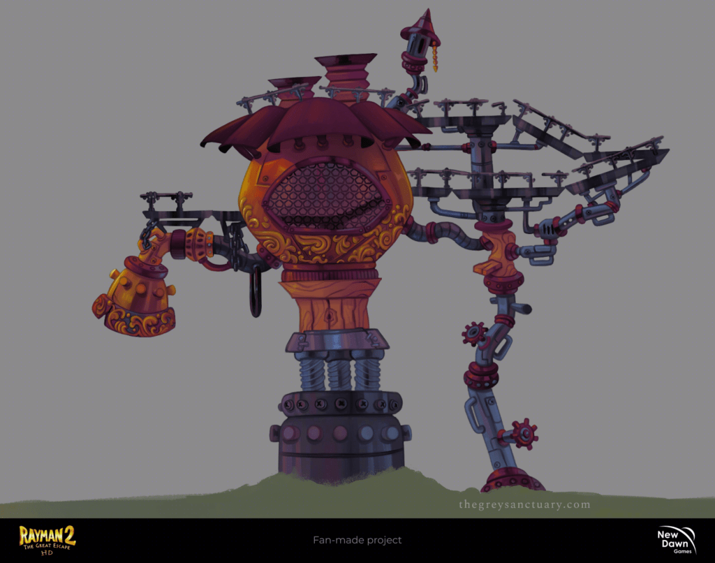
CHAPTER 4: Oil Pump Station Redesign
One of the last tasks I had last month was to redesign completely the Pump Oil Station from the Fairy Glade. As you can see, the original concept was a simple design with a big tube, and to my surprise, the underwater level was also part of the task (I believe in the PSP version you have access to the underwater level once the oil stopped and cleared out). So I had to consider everything, from shape, types of metals, ornament, and other elements that can be used as technical aspects.


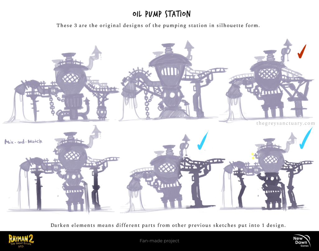
So instead of focusing on doing that design, I started with simple silhouettes and let the 2D and 3D departments rip some parts for mix-and-match. I received several constructive criticisms and many questions as to why I designed or added those particular elements. So for everything, I had to have an explanation and/or purpose.
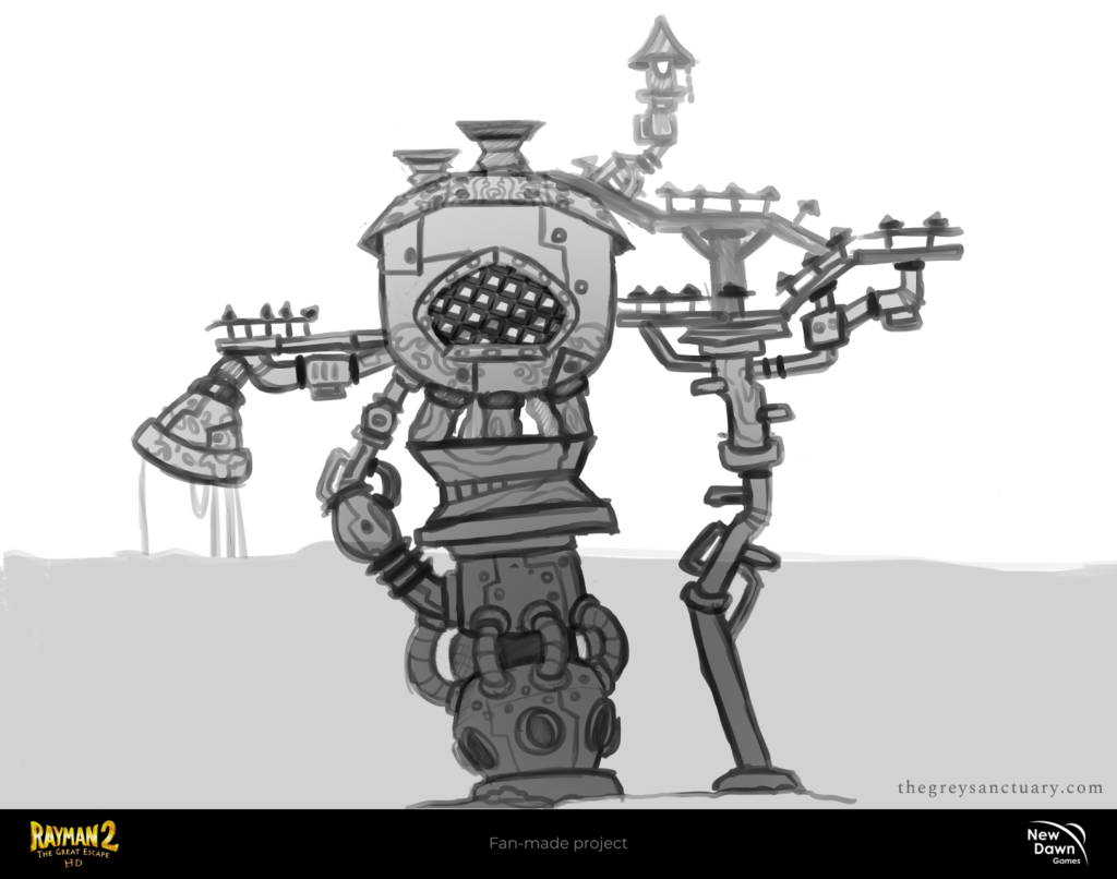
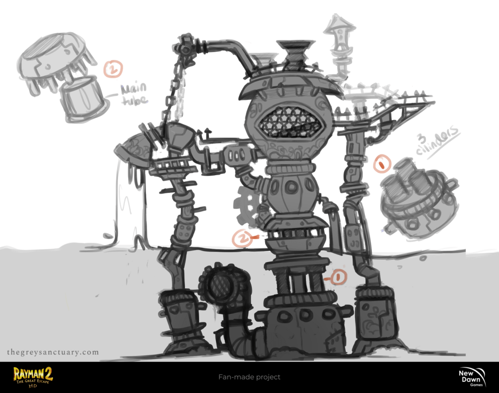
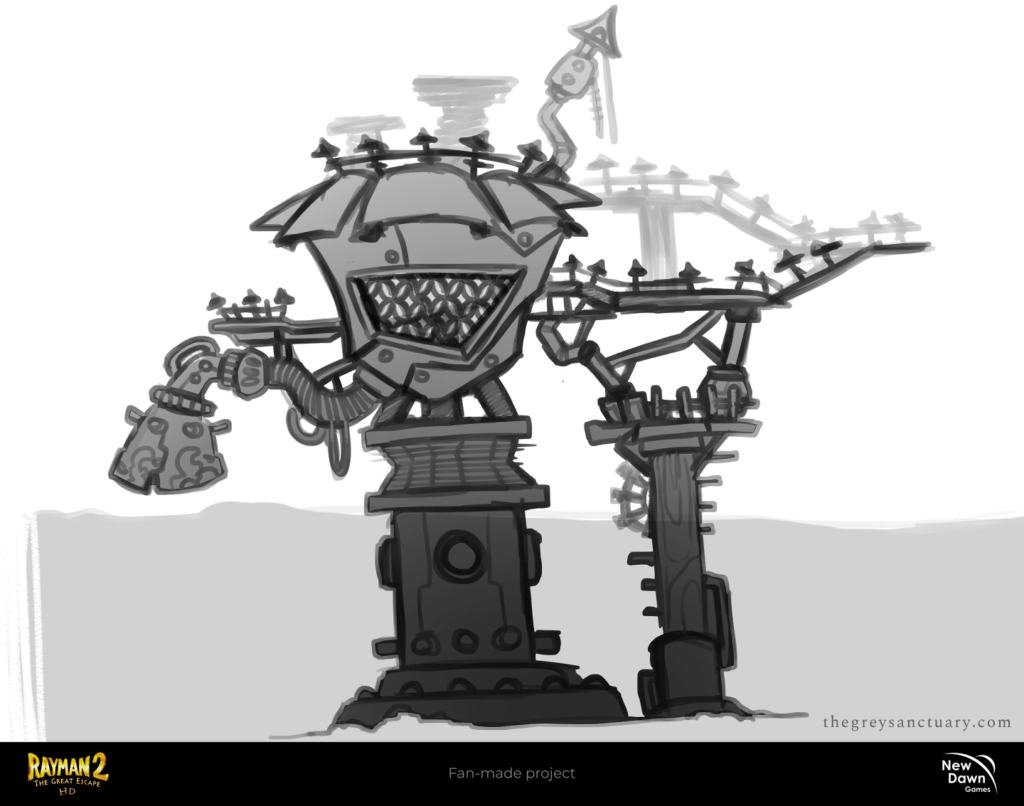
Once both teams agreed on the desired design, I developed 3 alternatives, and all of them chose the one that was loyal to the previous concept from the game (the middle one). Still, there were some parts interchanged, and I was asked to make additional visual information as guidance.


It is normal for the departments to question everything, so I had to be mindful and meticulous with the explanations of why I designed it that way. For example, what if pirates needed to come back to the top of the pump oil station if they fell from the bridge? Is it a good idea that the underwater level is made up of wood?

Opening Blender For The First Time
I was having difficulty drawing from several perspectives to add some essential information, so I decided to venture with Blender for the first time while watching some basic tutorials. In 3 hours I managed to “sculpt” a base and took a few screenshots from different angles.
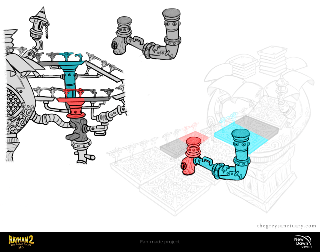
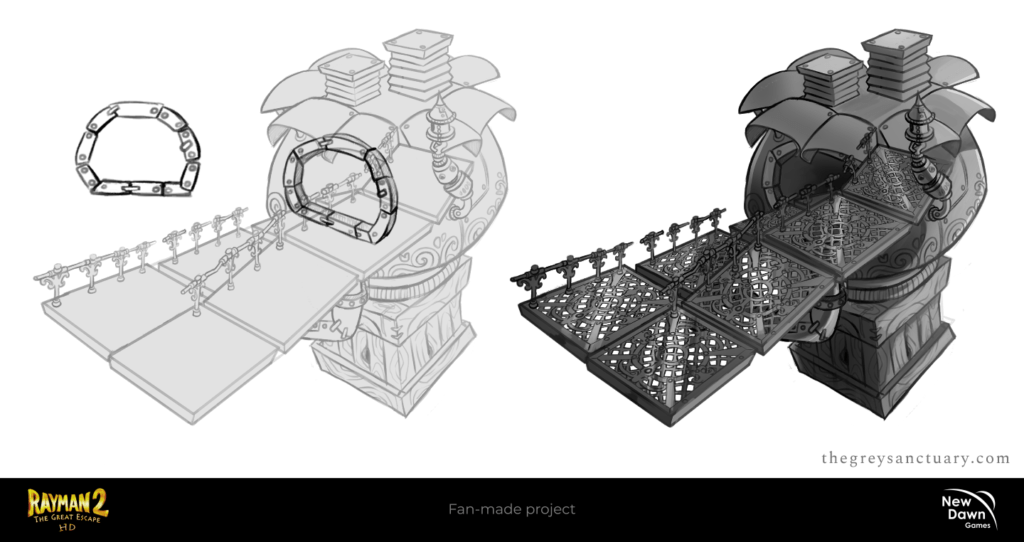
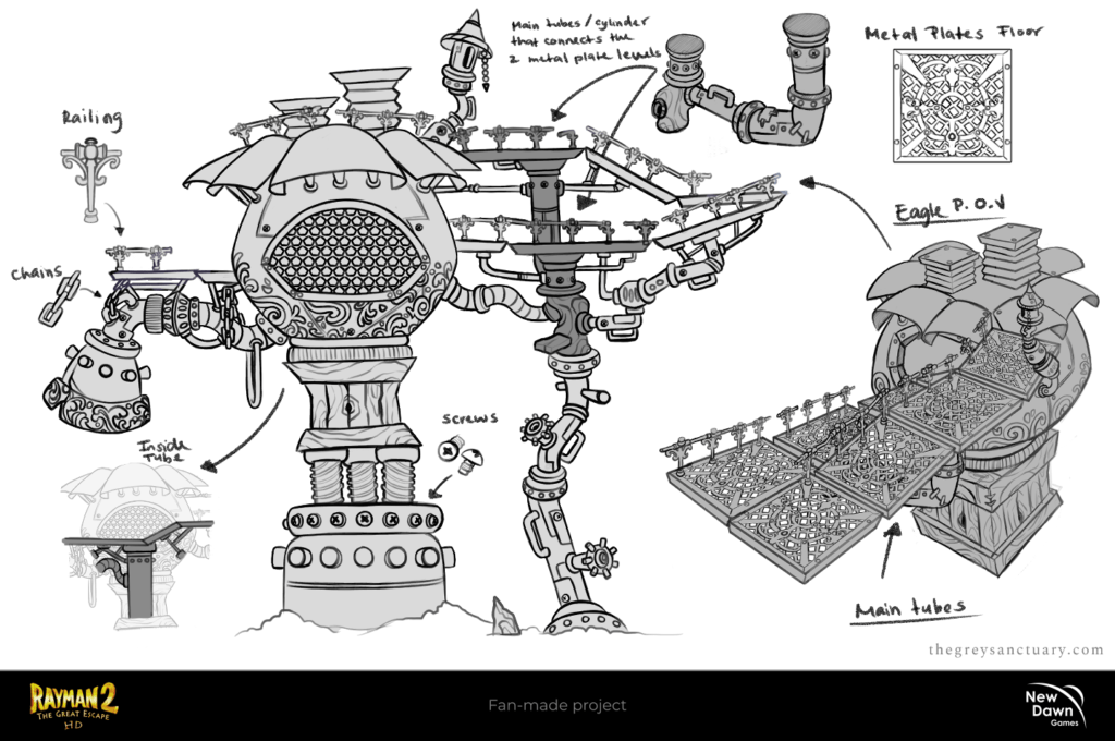
Finally, I was able to provide important visual details to the 3D department. I think the 2 most difficult parts were to draw logically the main tubes that connected with the 1st and second bridge, and lastly, the creation of the “geometric” rooftop with organic round plates.
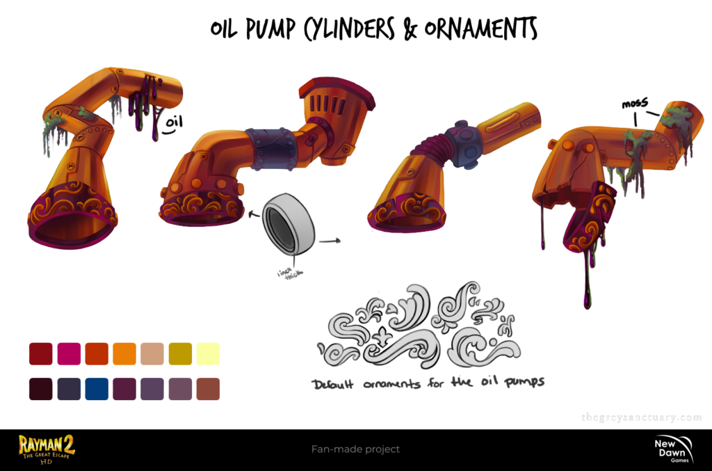
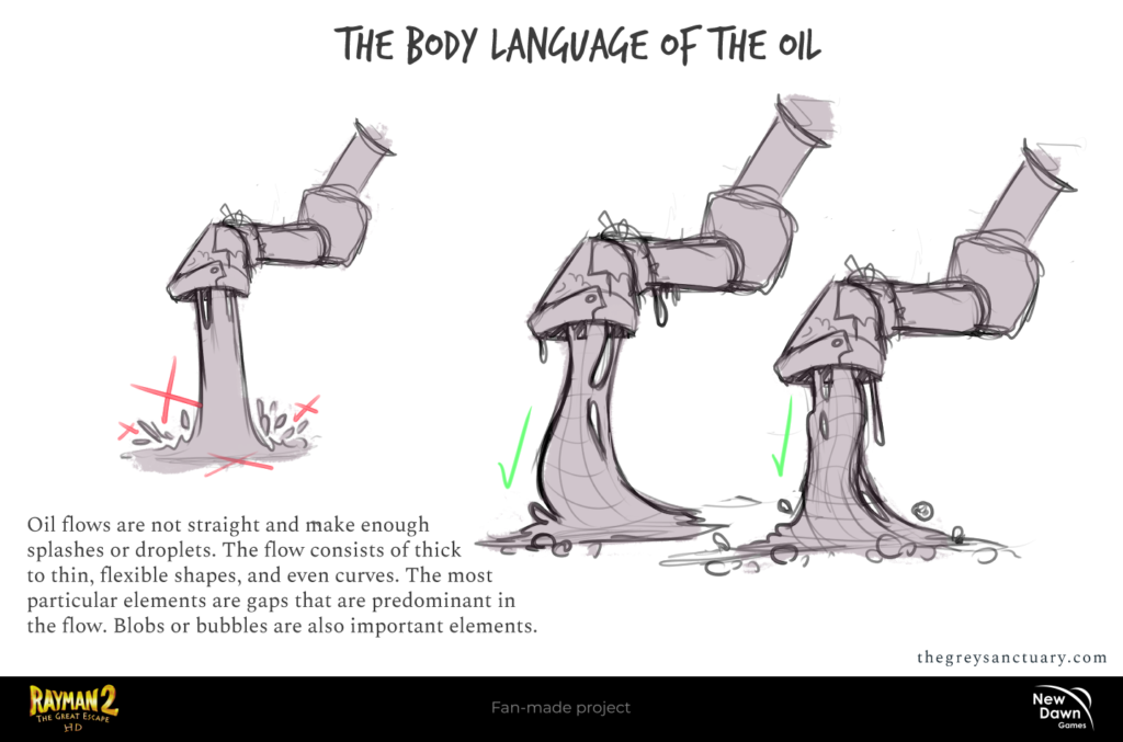
Here, I was establishing the rules and requirements of the body language of the oil, which has a gooey consistency. The oil flow from the cylinders must have gaps and flexible and curved shapes to convey the thickness consistency. These were based throughout the whole game on different levels.
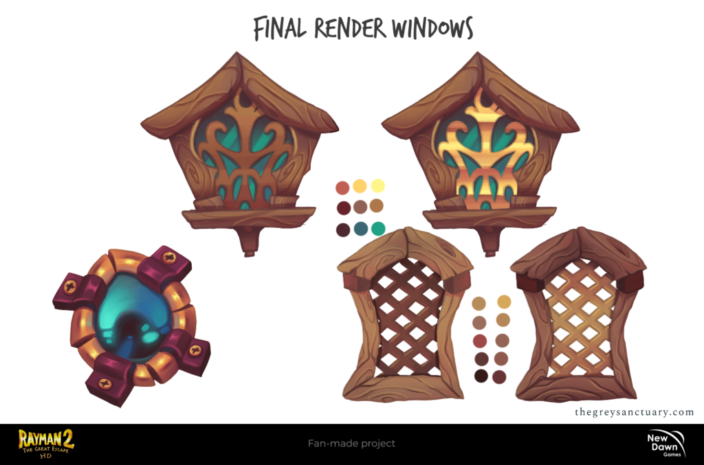
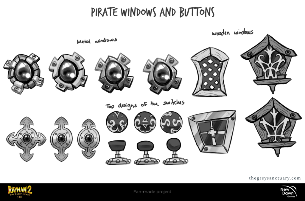
CHAPTER 5: Pirate Structure Assets
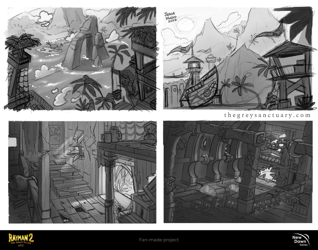
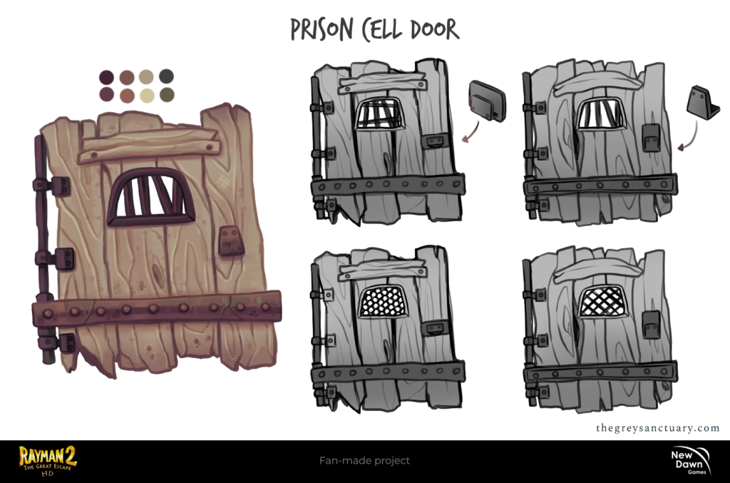
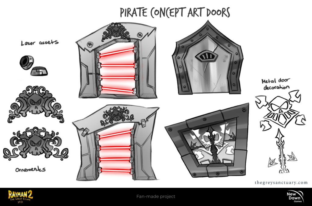
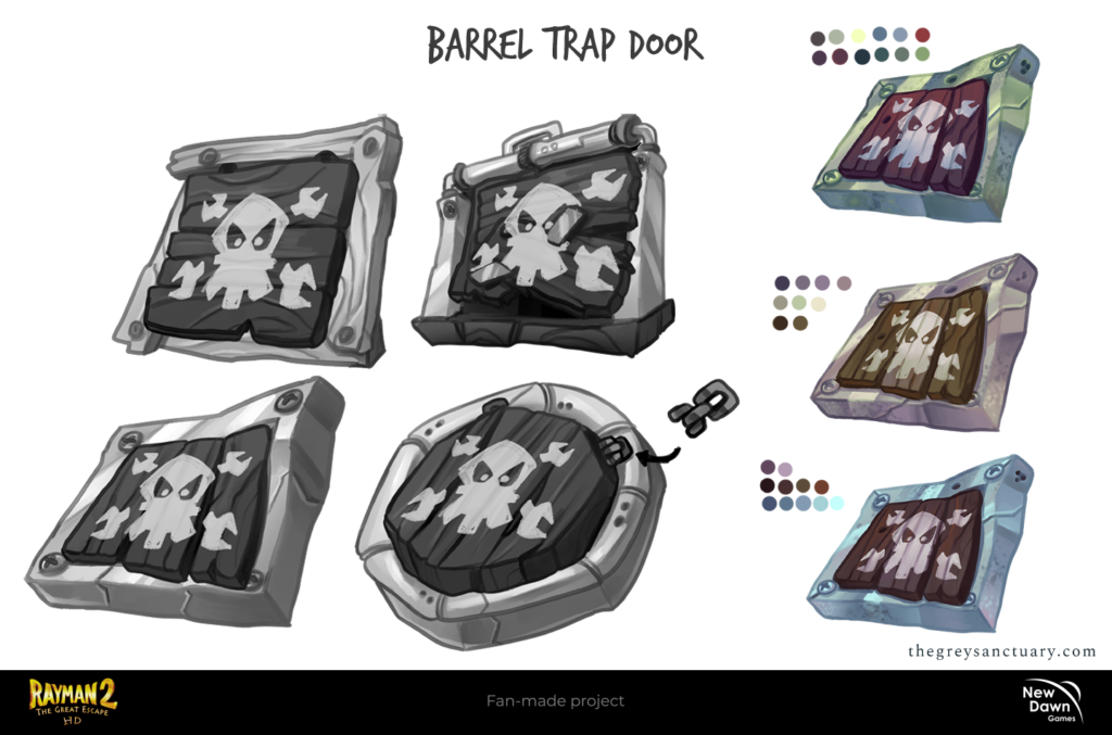
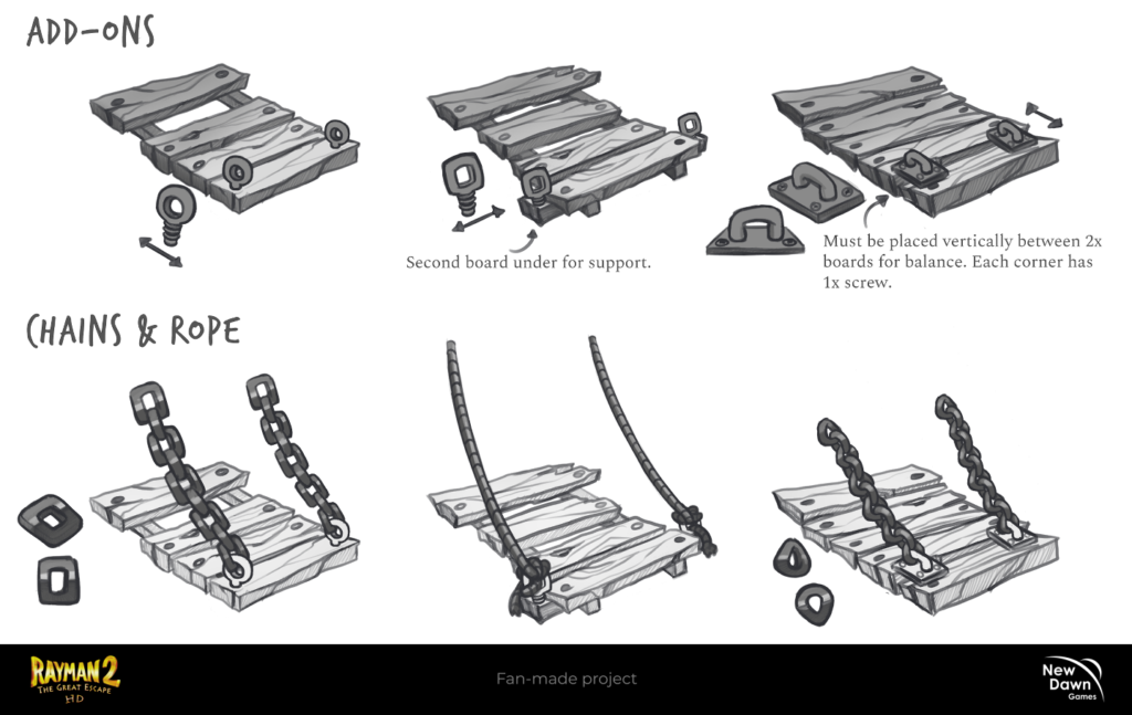
One of the fun parts of this year was redesigning as many props as possible according to my 2D Roadmap’s deadlines. These are mostly located on several levels, including the “pirate prison” and “Pirate Bastion”. I used the RayMap to find some, see their functionality, and be able to do a breakdown of how the parts worked. You can actually see this in the “prison cell door” redesign. The 3D team provided the other prop designs with a documented PDF of all the existing assets in the game.
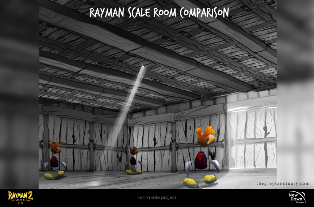
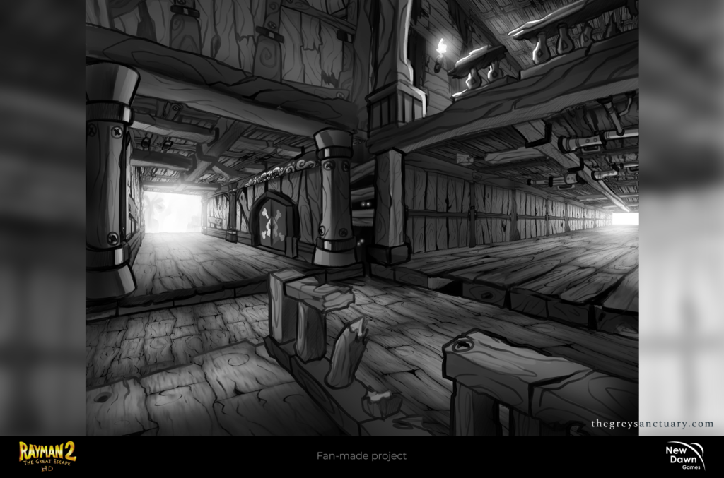
CHAPTER 6: Pirate Interior Designs
In this final chapter, I was able to push my comfort zone with the interior designs. This was one of the most complicated tasks since it involved creating rooms and corridors with the assets we have done previously (walls, ceilings, and floors), including from other 2D members, and building them up using perspective, and grayscale for fore, mid and background.
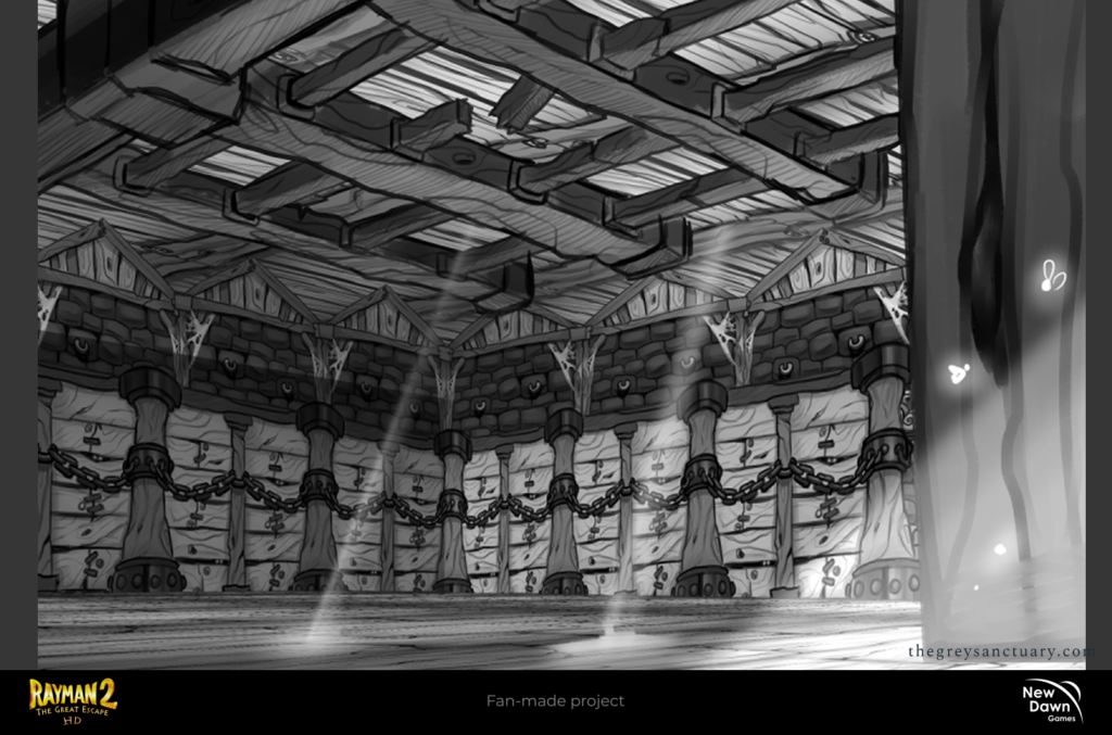

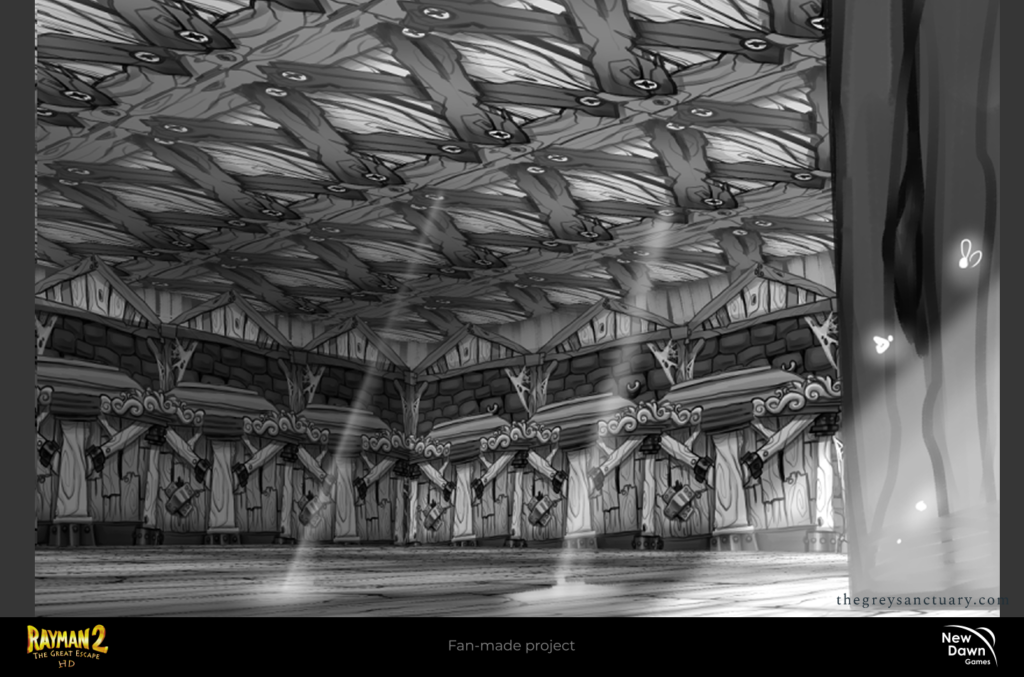
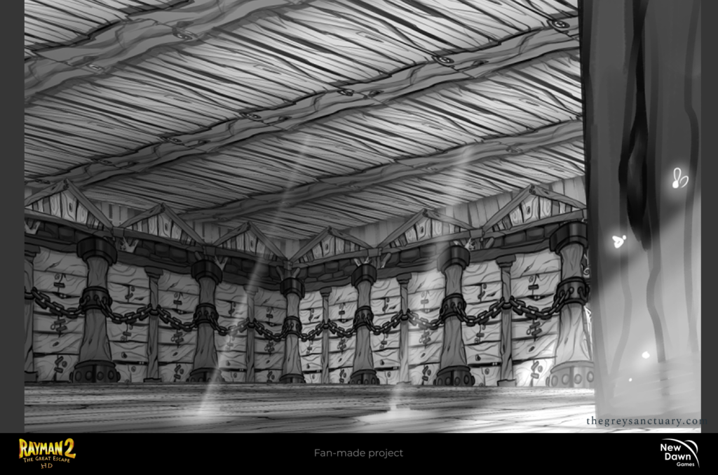
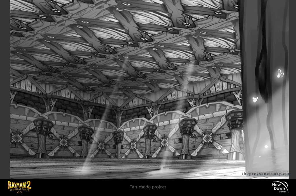
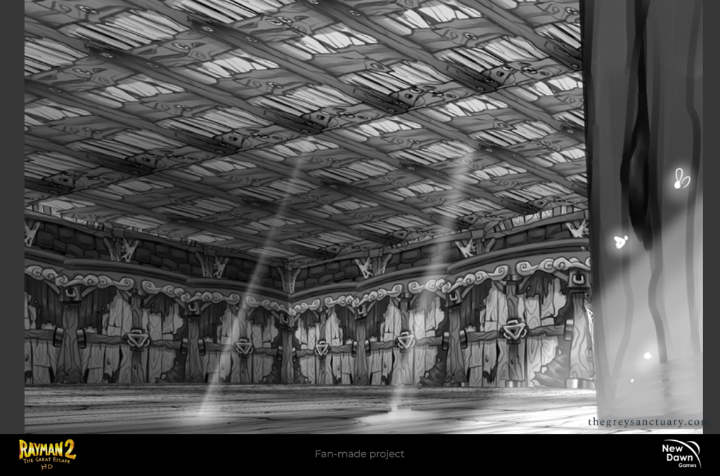
The whole point of these interations was to create possible combinations that aligned faithfully to the style while complying with specific requirements and protocols. I had to also use other concept artist’s assets (floors, walls, and ceilings) with mine in a single work. We wanted to see how fluid these assets could coexist while complying with the visual language of the redesign. I also got asked by a member of the Programming Department to use Rayman as a scale to estimate and calculate certain aspects of the artworks. This helped visually stuff for the 3D Department in the future. Unfortunately, most of these previous walls were not compatible with the style, since they looked complex and distracting. Even though I aimed to comply with the original designs, there were times I did break some rules during the experimentation for the sake of bringing a refreshing look to the game.
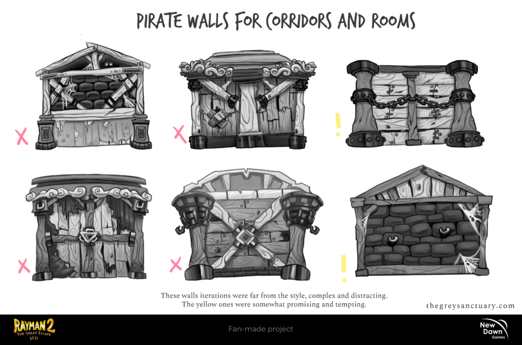
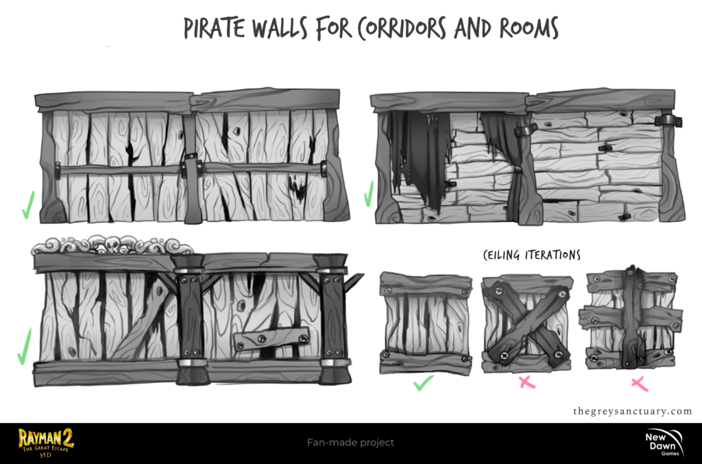
Here are some of the concept art I did for the walls. The previous one relied on more information and newer materials not seen before in the original game, the Director was not keen on these. So, I ended up replicating the old ones but with different patterns and simplicity. The trick was to actually make the walls more wider and double it up, instead of individual designs to make it less repetitive. These double walls worked due to being supportive (design wise), seamless, and consecutive.
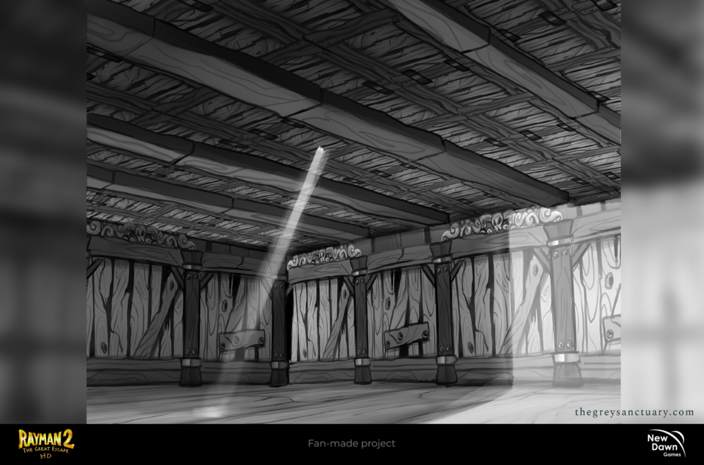
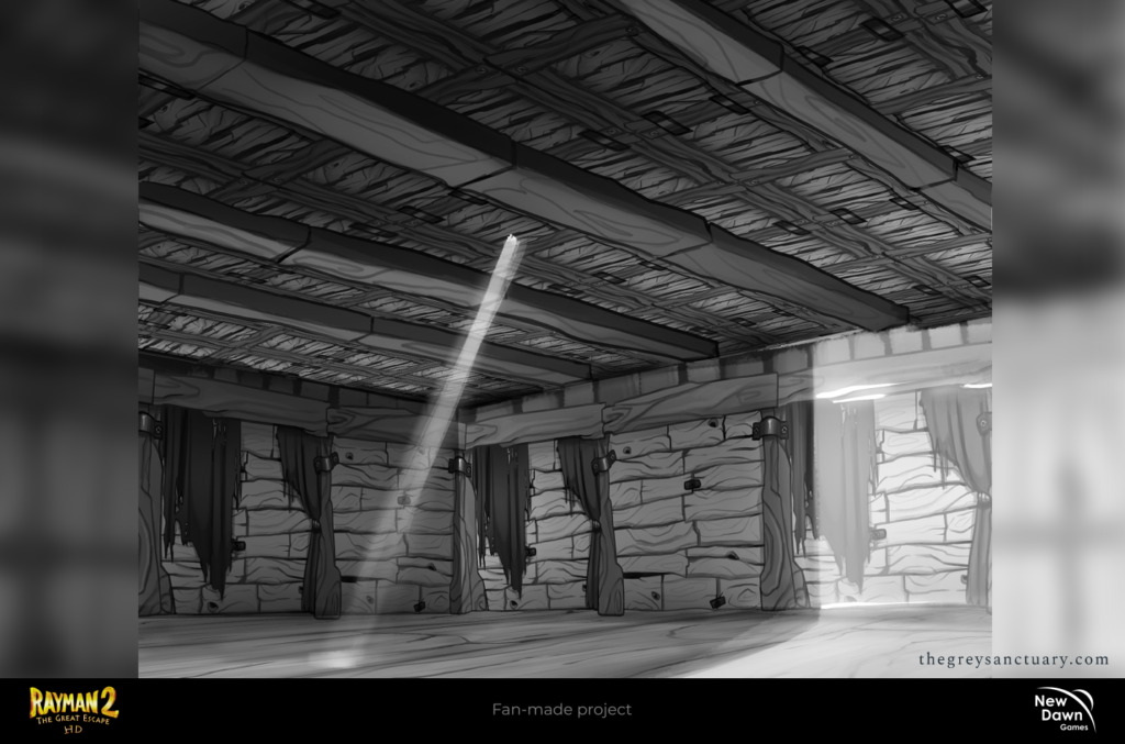
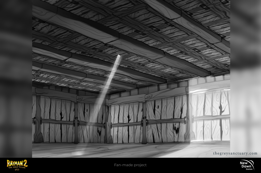
And thus, this concludes my final chapter with NDG. I wished I could’ve stayed longer, and done so much more. Perhaps eventually I will be uploading more unofficial stuff that never made it to the team. Just to fill some gaps here and there. But documenting the creative process was fun and had a lot of new admirers and compliments privately, especially from other indie studios and big studios.
You must be logged in to post a comment.